Google’s $2 Trillion Branding Mistake, And How Your Business Can Avoid It
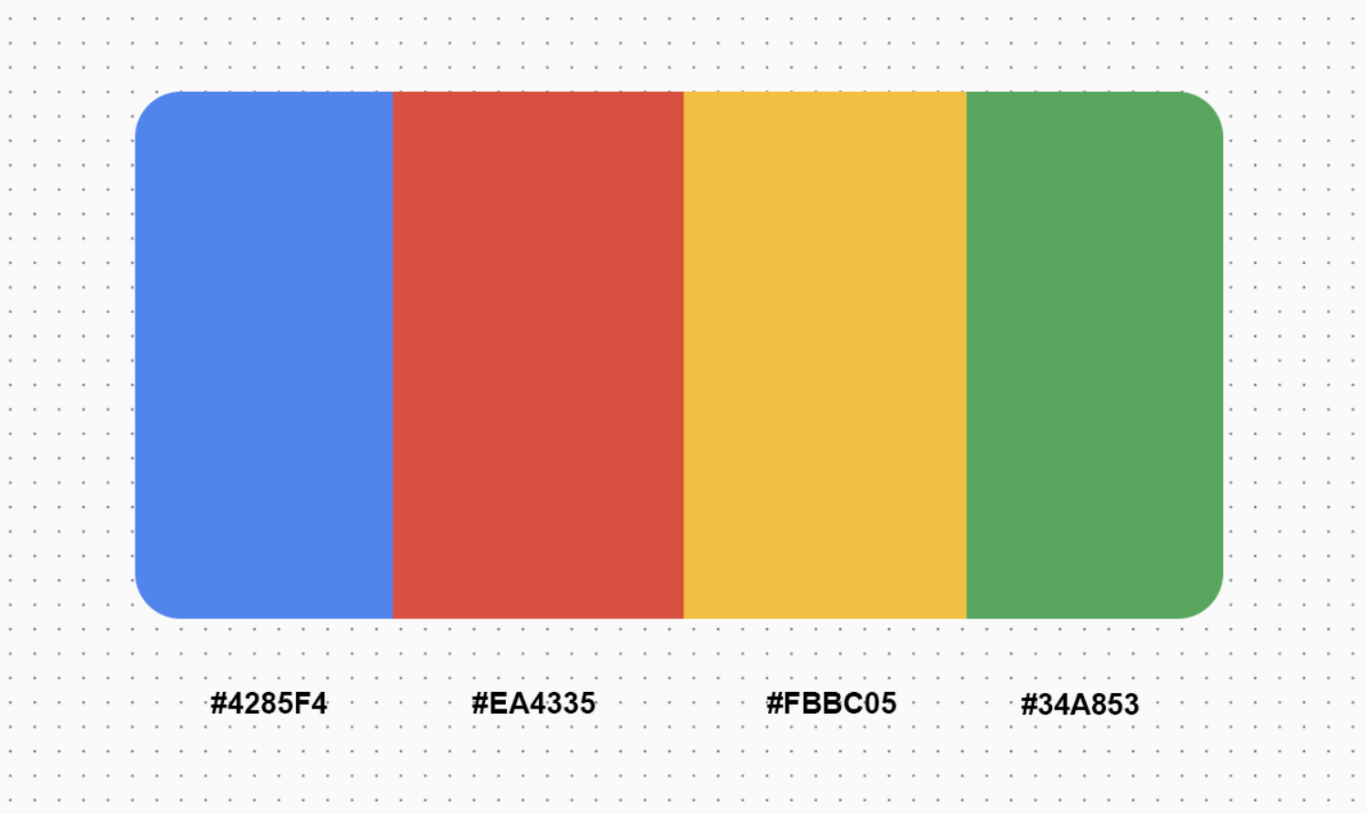
Google has one of the most recognisable brand systems in the world. Red, yellow, green and blue are not just colours in its palette. They are part of the way people recognise the brand, even when the word “Google” is nowhere to be seen.

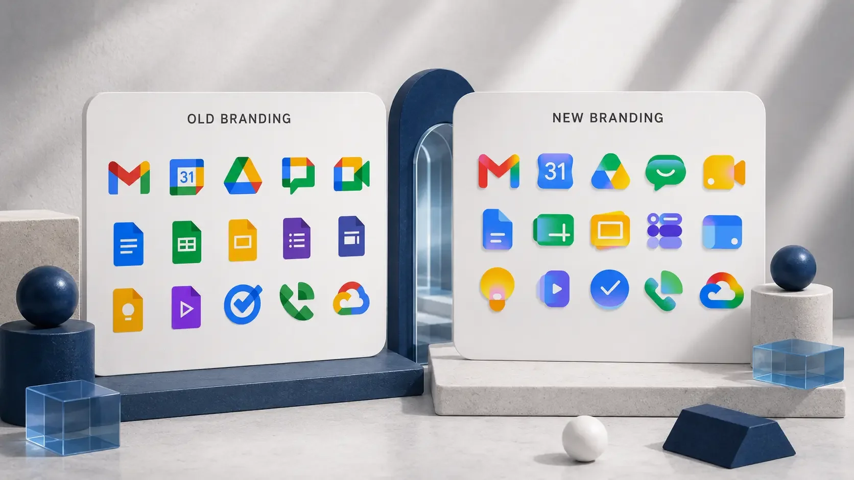
That is why the latest refresh of Google’s Workspace icons is such a useful branding lesson. Google has been rolling out redesigned icons across apps like Gmail, Drive, Docs, Sheets, Calendar and Tasks, moving them into a more gradient-led visual direction with softer colour transitions and a more modern feel. In isolation, some of the icons are quite polished.
They look cleaner, more current and more aligned with the visual language Google has been building around its products. The issue is not that Google updated the icons. Brands evolve, and they should. The issue is that a company with one of the strongest colour systems in the world had a rare opportunity to make that system work harder, and the result still feels more like visual consistency than brand strategy.
For a company valued in the trillions, that matters. Not because Google is suddenly going to lose brand recognition over a few app icons, but because it shows how easily even the biggest brands can confuse “everything looks connected” with “everything has a clear purpose”. That same mistake happens in small businesses all the time, just at a different scale.
Google’s use of colour theory creates a confused collection of apps that lack meaning outside of being ‘AI era’ ready.
The missed opportunity was not design, it was meaning
Google already had the ingredients for a stronger system. Four colours with enormous brand equity, a large ecosystem of apps and a genuine user problem to solve. The previous Workspace icons had been criticised for looking too similar, so there was a clear reason to revisit them.
The brief made sense: make the icons feel more distinct, easier to recognise and better suited to how people use Google’s products now.
The stronger strategic move would have been to use colour as a wayfinding system.
Imagine if blue meant productivity. Docs, Sheets, Slides. Green meant communication. Gmail, Meet, Chat. You'd know what you're opening before you even read the name. When a brand owns a recognisable visual asset, it should use it to create meaning, not just decoration.
That is where the refresh feels like a missed opportunity. The icons may look more modern, but modernity is not the same as clarity. A gradient can make something feel fresher, but it does not automatically help someone understand what they are looking at faster.
Colour should not be an afterthought
Colour is often treated as a taste decision, especially in small business branding. People choose colours because they feel premium, soft, bold, modern or different from what competitors are doing. That is part of it, but it should not be the whole decision.
A strong colour system can help organise information, separate services, guide attention and create a more intuitive brand experience. For a service-based business, colour might help distinguish strategy from implementation. For a clinic, it might separate treatment categories. For an ecommerce brand, it might clarify product ranges or campaign themes. For a consultant or creative business, it might help create structure across services, case studies, insights and calls to action.
This is where brand identity design becomes more strategic. The goal is not to use every colour everywhere because the palette looks nice. The goal is to decide what each part of the identity is there to do. If every element is used with the same intensity across every touchpoint, nothing has hierarchy. The brand might look consistent, but it becomes harder for people to understand what matters most.

A mockup of utilising colour theory to categorise apps based on their use eg: blue for productivity, green for communication
Most rebrands fail before the design starts
When a business feels like it has outgrown its brand, the first instinct is usually to fix the visible parts. The logo feels dated, the colours do not feel premium enough, the website looks clunky, the Instagram feed feels inconsistent or the photography no longer reflects the quality of the service. Those things might all be true, but they are usually symptoms of a deeper issue.
The business has changed, but the brand strategy has not caught up.
Maybe the audience has shifted. Maybe the offer has become more refined. Maybe the business is charging more, working with better clients or moving into a more competitive space. Maybe the founder knows the business is stronger than it looks, but the brand is still communicating an older version of it.
In those cases, a cosmetic refresh will only go so far. New colours will not fix unclear positioning. A new logo will not fix weak messaging. Better photography will not fix a website that does not explain the offer properly. A more polished Instagram grid will not fix a brand that does not know what it wants to be known for.
A proper rebrand should start with the business, not the moodboard. It should clarify what the brand needs to communicate, who it needs to attract, what people need to believe before they enquire and how every major touchpoint should support that perception.
The lesson for your business
Google can afford to have people debate its icons because the brand already has global recognition. Most businesses do not have that luxury. If someone lands on your website or finds you through social media, they are often forming an opinion before they ever speak to you. They are looking for cues that tell them whether you are credible, relevant and worth trusting.
That is why your branding needs to do more than look nice. It needs to make your business easier to understand and easier to choose. Your visual identity should reflect the level of your work. Your website should explain your value clearly. Your content should build recognition over time. Your photography should shape the right perception. Your ads should feel connected to the brand experience people land on.
The biggest mistake is assuming that because something looks consistent, it is working strategically. Sometimes the more important question is whether the brand is helping people make sense of the business faster.
Before changing your logo, colours, website or content direction, ask what the brand actually needs to do. Does it need to attract a more premium client? Does it need to separate different services more clearly? Does it need to feel more established? Does it need to communicate a shift in the business? Does it need to build trust faster?
Those questions matter more than whether the brand feels “fresh”. Fresh is temporary. Clear is useful.
Building a brand with more intention
The Google icon conversation is a reminder that branding is not just about recognition. It is about meaning. A strong brand system should make a business easier to navigate, easier to trust and easier to remember.
For smaller businesses, that might mean a full rebrand. It might mean a refined visual identity, a clearer website, stronger messaging, better photography or a more consistent content direction. The answer depends on what is actually creating friction.
MOUD MEDIA works with service-based businesses, start-ups and growing brands that have outgrown the way they currently look, sound or show up online. Through brand strategy, rebranding, visual identity, website design, photography, content creation and Meta Ads, we help build brand systems that feel more aligned with the level of the business and the direction it is heading.
If your brand looks consistent but still does not feel clear, it might be time to look at the strategy underneath it.